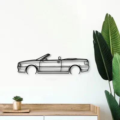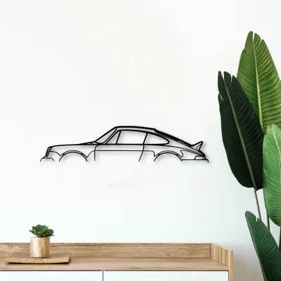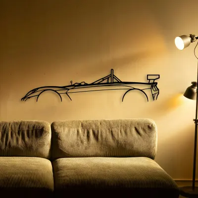
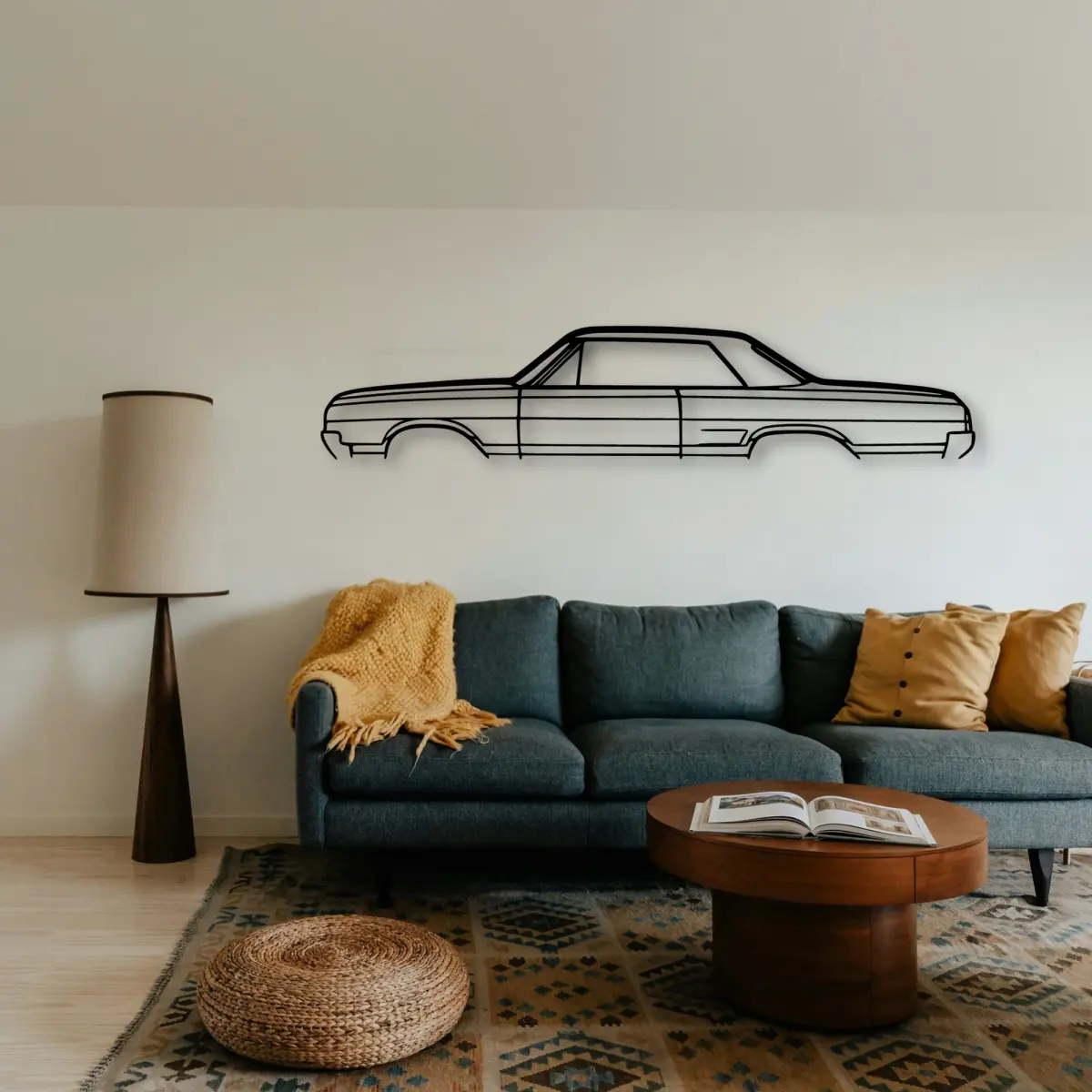
Driving culture is mostly small rituals: the prep, the playlist, the stop for coffee. A Oldsmobile outline is the part you keep.
The Oldsmobile 442 1965 dates to 1965, and that year's proportions are exactly what the cut outline keeps — the roofline and the stance are period-correct, not stylised.
At Tinvibe the Oldsmobile is offered as a sheet-metal profile in size ladder, from 50 cm to 140 cm, finished for indoor wall display. The smaller sizes suit a shelf or a study; the larger sizes take a full living room.
Why it suits a den wall
A Oldsmobile in cut metal belongs in the spaces cars actually live in. Over a workbench or a parked car it reads instantly.
Honest material, no colour
A Oldsmobile profile in steel asks the line to do all the work — there is no livery, no badge colour, no gradient to lean on.
Shoot the drive, keep the backing
A Oldsmobile enthusiast shoots with the backing in mind. Frame the car like the cutout you will buy.
Size ladder for the memory
Size ladder, one outline. The Oldsmobile is offered from a 50 cm shelf piece up to a 140 cm statement, all cut to the same profile.
- 50 cm — a shelf or a study; an accent, not a feature.
- 80 cm — still modest, but reads across a doorway.
- 100 cm — the safe feature-wall default.
- 120 cm — for rooms where the car is the subject.
- 140 cm — the full statement piece.
More than one on the backing
If you collect drives, let the Oldsmobile be one of a set with a rule. Next to its rivals, the differences are obvious.
Build the set
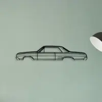
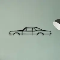
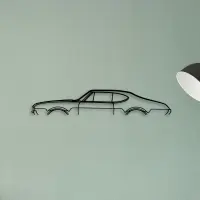
Hang two that differ in length, not in mood, and they read as a pair rather than a repeat.
Small changes in height read as care. Keep the horizon line steady when you group more than one.
Cut metal has a weight that printed art lacks. The shadow it casts is part of the piece, not an accident of the light.
The shadow line is the second drawing. Where it falls tells you as much as the metal itself.
A single strong subject is easier to live with than a wall that argues with itself.
A profile ages better than a photograph. There is no moment to date it and no colour to fall out of fashion.
A dedicated wall beats a crowded one. Give the car room and it repays the attention.
Hang it where the light lands first. The edge you notice on the way in is the edge worth cutting.
Read it from the doorway, not up close. The whole point is the gesture the line makes at a distance.
A row of identical small frames fights itself. One larger outline settles the backing instead.
The room sets the size. A busy wall wants a bigger outline to hold its own; a calm wall lets a smaller piece breathe.
Depth comes from the shadow. The gap between metal and wall is part of the composition, not a flaw.
Pick the outline that matches the room's energy: calm spaces want restraint, busy ones want a statement.
Resist the urge to fill. An empty margin around the outline is what makes it feel considered.