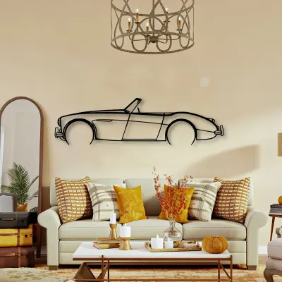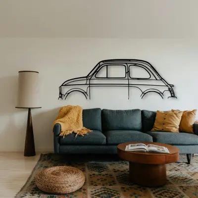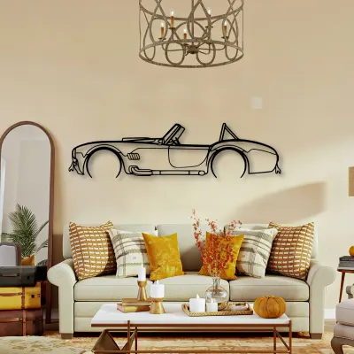
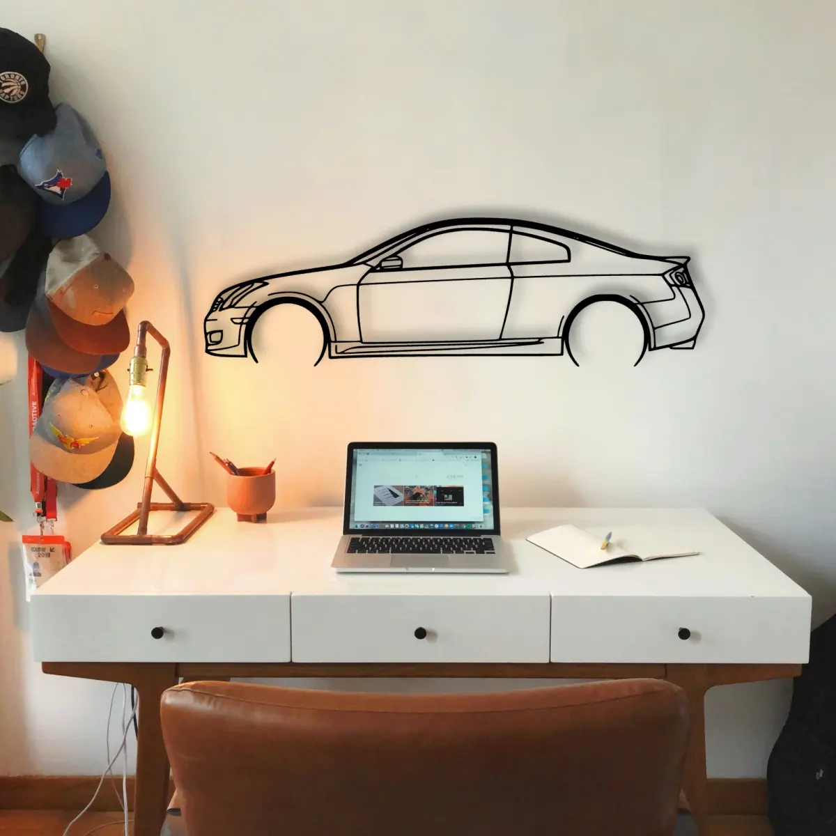
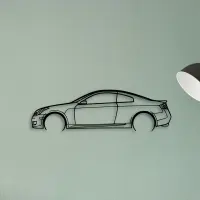
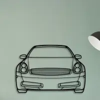
The Infiniti outline reads as a shape first and a car second. Photographing it is really about capturing that shape, not the metal.
The Infiniti G35 2006 dates to 2006, and that year's proportions are exactly what the cut outline keeps — the roofline and the stance are period-correct, not stylised.
What makes the Infiniti work as piece is that it carries no colour of its own. Cut from sheet metal and finished for indoor display, it sits quietly in almost any room while the outline does the talking.
More than one on the plane
If you collect, let the Infiniti be one of a set with a rule. Next to its rivals, the differences are obvious.
Build the set
Why it suits a studio wall
A Infiniti in cut metal belongs in the spaces cars actually live in. Over a workbench or a parked car it reads instantly.
Keep the horizon steady
When you hang more than one Infiniti outline, align the bottom edges. A steady horizon is what makes a group feel composed rather than scattered.
Era written into the line
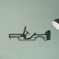
Period is baked into proportion. A Infiniti from one decade sits differently from another, and a form is the fastest way to see that gap.
Group by a rule
A wall of Infiniti outlines works when it has a rule — same era, same body style, or same marque. Without a rule it reads as a pile.
- Same era: let the decades argue with each other.
- Same body style: compare the proportions.
- Same marque: read the brand's habits at a glance.
Five sizes, one outline
Every Infiniti form comes in the same five sizes: 50 cm, 80 cm, 100 cm, 120 cm and 140 cm. The price steps with the size, from $69.95 to $209.95.
- 50 cm — a shelf or a study; an accent, not a feature.
- 80 cm — still modest, but reads across a doorway.
- 100 cm — the safe feature-wall default.
- 120 cm — for rooms where the car is the subject.
- 140 cm — the full statement piece.
Hang it where the light lands first. The edge you notice on the way in is the edge worth cutting.
A row of identical small frames fights itself. One larger outline settles the plane instead.
Metal keeps its line. Unlike paper, it will not curl, fade, or bow under a warm lamp.
Grouping works when the shapes contrast. A long low outline next to a tall upright one reads as a conversation, not a pile.
A profile on the plane is a quiet kind of confidence. It does not shout the spec sheet; it simply states the shape.
Quiet rooms suit a smaller form; loud rooms need one that can hold its own from across the space.
Placement is a quiet decision. Eye level for a feature wall, slightly above a desk, and well clear of a door swing that would clip it.
Colour is optional here. The outline carries the identity, so the plane behind it can stay exactly as it is.
Give it room to mean something. A form left alone on a clear wall says more than the same shape lost in a crowd.