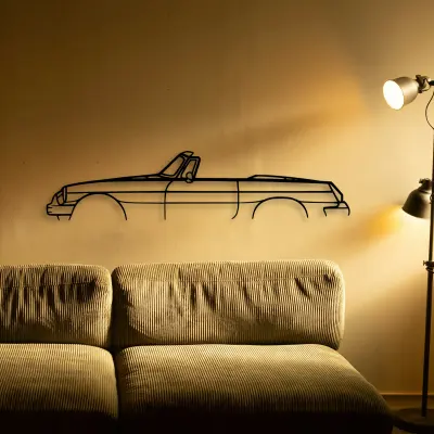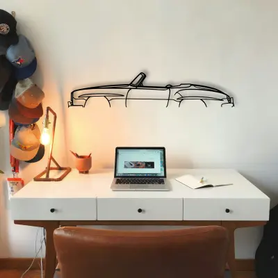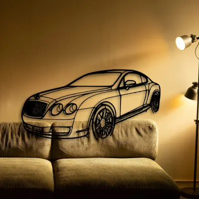
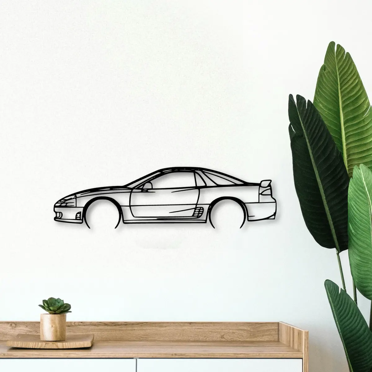
The Mitsubishi is the kind of shape people recognise instantly, which is why it works as both a road companion and a memory on the panel.
The Mitsubishi 3000gt 1994 dates to 1994, and that year's proportions are exactly what the cut outline keeps — the roofline and the stance are period-correct, not stylised.
At Tinvibe the Mitsubishi is offered as a cut outline in five options, from 50 cm to 140 cm, finished for indoor wall display. The smaller sizes suit a shelf or a study; the larger sizes take a full man cave.
Honest material, no colour
Because the Mitsubishi comes in bare cut metal, every proportion is exposed. That is harder than a photograph, and it is why a good outline feels earned.
Five options for the memory
Five options, one outline. The Mitsubishi is offered from a 50 cm shelf piece up to a 140 cm statement, all cut to the same profile.
- 50 cm — a shelf or a study; an accent, not a feature.
- 80 cm — still modest, but reads across a doorway.
- 100 cm — the safe feature-wall default.
- 120 cm — for rooms where the car is the subject.
- 140 cm — the full statement piece.
Stops worth pulling over for
The Mitsubishi fan pulls over for the view, the light, and the photo that becomes the panel piece. Plan two, not twenty.
The playlist is part of the drive
A Mitsubishi road trip has a tempo. The playlist should match the road, not fight it.
More than one on the panel
A row of Mitsubishi outlines, each a different trip, turns a wall into a timeline you can read at a glance.
Build the set
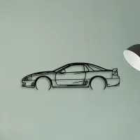
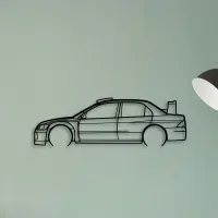
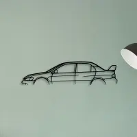
Scale matters more than people expect. A piece that is too small disappears; one that is sized to the panel reads as intentional from the doorway.
Think in edges, not pictures. The cut defines the object, and the shape defines the cut.
Recognition is the whole point. The outline is built so the car reads before the words do.
Start with one. A single correct piece teaches the eye what the rest of the panel should do.
The room sets the size. A busy wall wants a bigger outline to hold its own; a calm wall lets a smaller piece breathe.
Quiet rooms suit a smaller shape; loud rooms need one that can hold its own from across the space.
The shadow line is the second drawing. Where it falls tells you as much as the metal itself.
A neutral wall is a gift. It lets the cut do the talking without competing colour.
A row of identical small frames fights itself. One larger outline settles the panel instead.
Pick the outline that matches the room's energy: calm spaces want restraint, busy ones want a statement.
Lighting decides the mood. An even wash from above flatters the edge; a single hard spotlight only hardens one corner.
A shape travels. Move it between rooms and it still makes sense, because the shape is the message.
Colour is optional here. The outline carries the identity, so the panel behind it can stay exactly as it is.