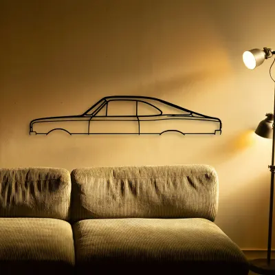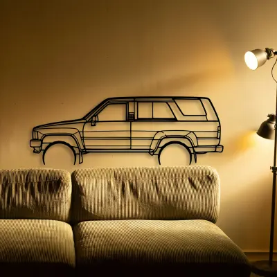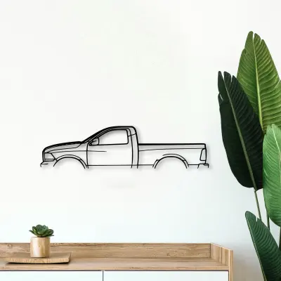
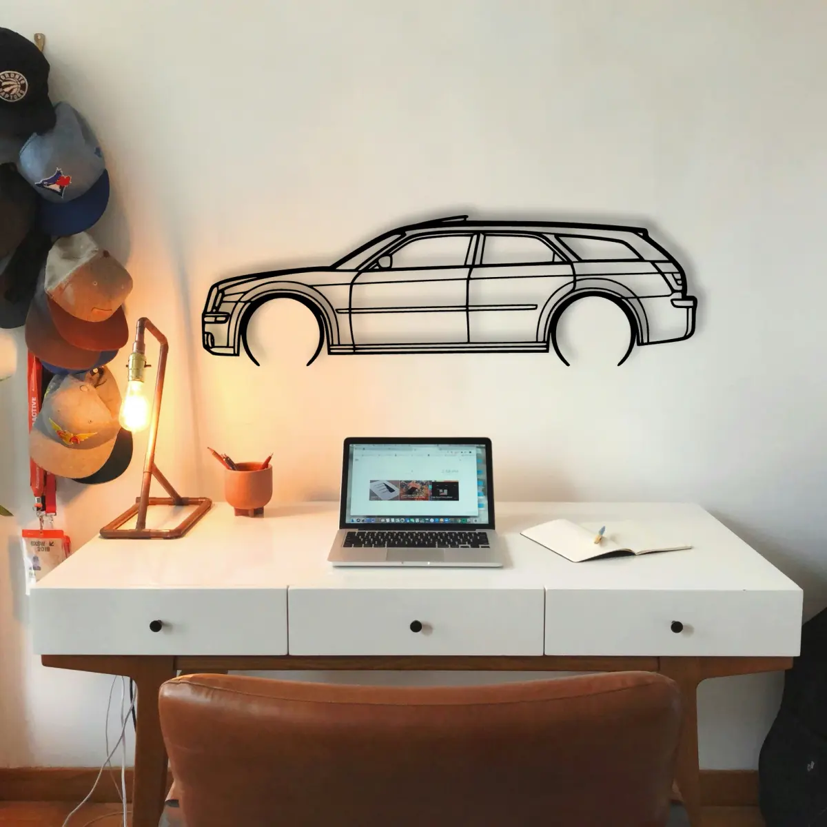
A laser-cut Chrysler piece carries no colour of its own, which makes it a forgiving subject — and a demanding one, because every shadow counts.
The Chrysler 300c 2006 Touring dates to 2006, and that year's proportions are exactly what the cut outline keeps — the roofline and the stance are period-correct, not stylised.
At Tinvibe the Chrysler is offered as a laser-cut outline in five size steps, from 50 cm to 140 cm, finished for indoor wall display. The smaller sizes suit a shelf or a study; the larger sizes take a full living room.
Why it suits a man cave wall
Garages reward honest shapes. The Chrysler cut from steel belongs there in a way a framed poster never quite does.
Avoid busy backgrounds
A patterned or cluttered wall behind a Chrysler outline fights the shape. Simplify the backdrop and the car wins.
Neutral walls win
Hang a Chrysler outline on a flat, single-colour surface and the cut reads instantly, with nothing competing.
Era written into the line
You can often date a Chrysler by its roof alone. The cut keeps those period cues so the shape reads as a moment without a caption.
Five size steps, one outline
Five size steps, one outline. The Chrysler is offered from a 50 cm shelf piece up to a 140 cm statement, all cut to the same profile.
- 50 cm — a shelf or a study; an accent, not a feature.
- 80 cm — still modest, but reads across a doorway.
- 100 cm — the safe feature-wall default.
- 120 cm — for rooms where the car is the subject.
- 140 cm — the full statement piece.
More than one on the surface
A row of Chrysler outlines, each a different car, turns a wall into a timeline you can read at a glance.
Build the set
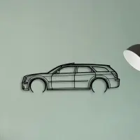
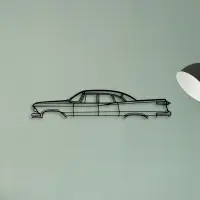
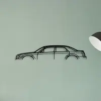
An outline travels. Move it between rooms and it still makes sense, because the shape is the message.
Read it from the doorway, not up close. The whole point is the gesture the line makes at a distance.
Small changes in height read as care. Keep the horizon line steady when you group more than one.
Depth comes from the shadow. The gap between metal and wall is part of the composition, not a flaw.
The surface behind should be the quietest thing in the room. Let the outline be the loud part.
Light from the side reveals the cut; light from the front flattens it. Aim for the reveal.
A single strong subject is easier to live with than a wall that argues with itself.
Give it room to mean something. An outline left alone on a clear wall says more than the same shape lost in a crowd.
Placement is a quiet decision. Sight line for a focal wall, slightly over a desk, and well clear of a door swing that would clip it.
The shadow line is the second drawing. Where it falls tells you as much as the metal itself.
Cut metal has a weight that printed art lacks. The shadow it casts is part of the piece, not an accident of the light.
Colour is optional here. The outline carries the identity, so the surface behind it can stay exactly as it is.