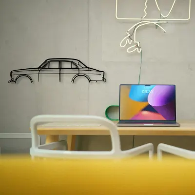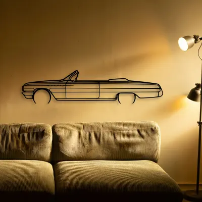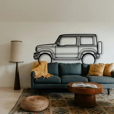
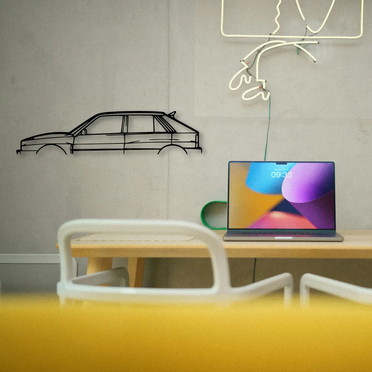
Most photos of wall art fail for one reason: they fight the piece. A Lancia silhouette wants clean light and a calm background, not a clever setup.
The Lancia Delta 1992 dates to 1992, and that year's proportions are exactly what the cut outline keeps — the roofline and the stance are period-correct, not stylised.
The Lancia pieces in our range are cut from sheet metal and delivered ready to mount, with the price stepping from $69.95 at 50 cm to $209.95 at 140 cm — a range that lets the same outline work by a workstation or across a full wall.
A quick dust, nothing more
Care for a Lancia cutout is close to nothing: a soft cloth removes dust, and that is the whole routine. No polish, no glass.
Between displays
If a Lancia silhouette comes off the wall for a while, store it flat and dry. Cut steel keeps its line as long as it stays straight.
Era written into the line
You can often date a Lancia by its roof alone. The cut keeps those period cues so the shape reads as a moment without a caption.
More than one on the wall
If you collect, let the Lancia be one of a set with a rule. Next to its rivals, the differences are obvious.
Build the set
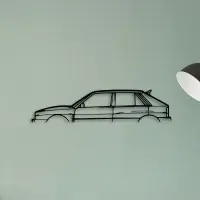
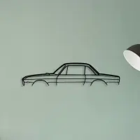
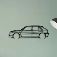
Honest material, no colour
Because the Lancia comes in bare cut metal, every proportion is exposed. That is harder than a photograph, and it is why a good outline feels earned.
Five sizes, one outline
Five sizes, one outline. The Lancia is offered from a 50 cm shelf piece up to a 140 cm statement, all cut to the same profile.
- 50 cm — a shelf or a study; an accent, not a feature.
- 80 cm — still modest, but reads across a doorway.
- 100 cm — the safe feature-wall default.
- 120 cm — for rooms where the car is the subject.
- 140 cm — the full statement piece.
A dedicated wall beats a crowded one. Give the car room and it repays the attention.
Placement is a quiet decision. Eye level for a feature wall, slightly above a desk, and well clear of a door swing that would clip it.
Colour is optional here. The outline carries the identity, so the wall behind it can stay exactly as it is.
Quiet rooms suit a smaller silhouette; loud rooms need one that can hold its own from across the space.
Pick the outline that matches the room's energy: calm spaces want restraint, busy ones want a statement.
Small changes in height read as care. Keep the horizon line steady when you group more than one.
Maintenance is close to nothing. A quick dust is enough; there are no frames to chip and no glass to clean.
The right size is the one you forget to notice because it fits the wall so well.
The wall behind should be the quietest thing in the room. Let the outline be the loud part.
A neutral wall is a gift. It lets the cut do the talking without competing colour.
Give it room to mean something. A silhouette left alone on a clear wall says more than the same shape lost in a crowd.