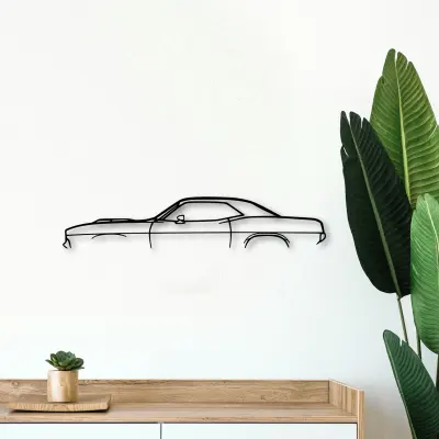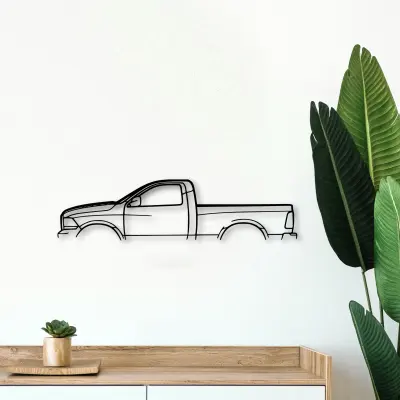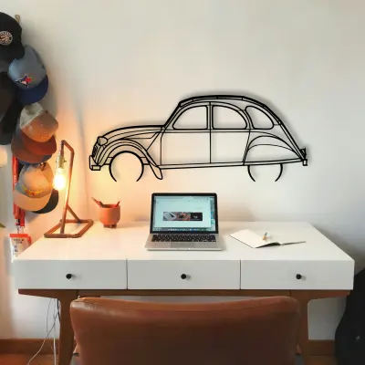
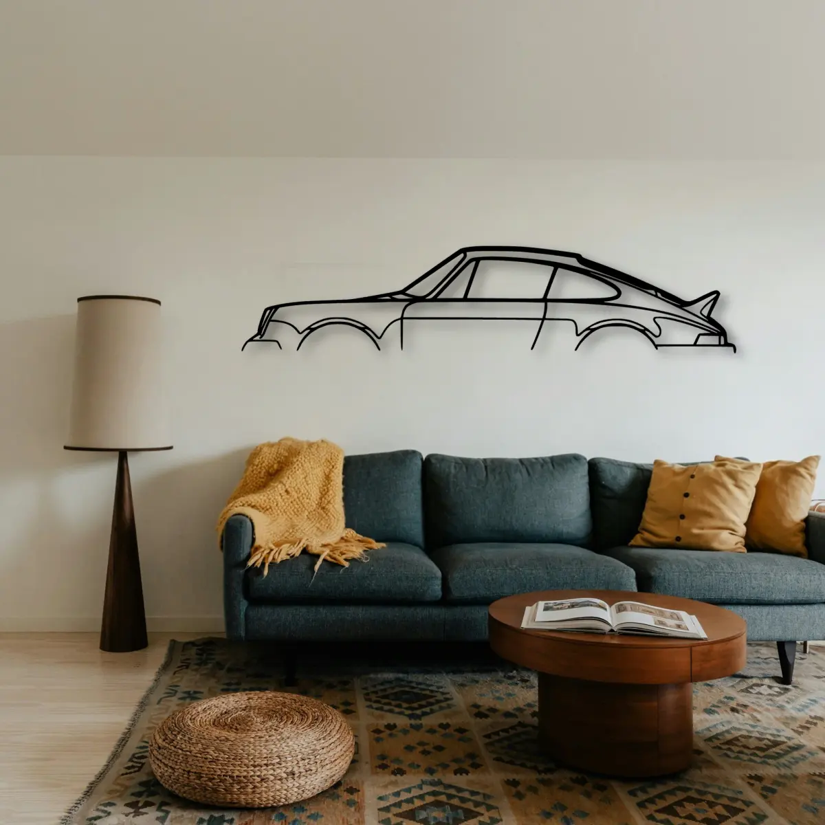
A Porsche cut outline is built to be looked at, and looking at it well is half the fun. Before you point a camera at it, it helps to understand what the outline is doing on the backing.
At Tinvibe the Porsche is offered as a cut outline in five options, from 50 cm to 140 cm, finished for indoor wall display. The smaller sizes suit a shelf or a study; the larger sizes take a full shed.
Why it suits a shed wall
A Porsche in cut metal belongs in the spaces cars actually live in. Over a workbench or a parked car it reads instantly.
Contrast in length, not mood
Hang a long, low Porsche outline next to a taller one. The contrast in length is what makes a pair feel like a conversation.
More than one on the panel
If you collect, let the Porsche be one of a set with a rule. Next to its rivals, the differences are obvious.
Build the set
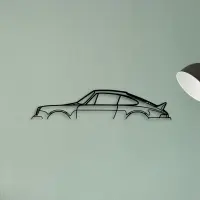
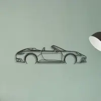
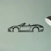
Keep the horizon steady
A row of Porsche silhouettes reads best with one shared baseline. Small height changes read as care, not accident.
Five options, one outline
Five options, one outline. The Porsche is offered from a 50 cm shelf piece up to a 140 cm statement, all cut to the same profile.
- 50 cm — a shelf or a study; an accent, not a feature.
- 80 cm — still modest, but reads across a doorway.
- 100 cm — the safe feature-wall default.
- 120 cm — for rooms where the car is the subject.
- 140 cm — the full statement piece.
A row of identical small frames fights itself. One larger outline settles the panel instead.
The shadow line is the second drawing. Where it falls tells you as much as the metal itself.
A piece does not need a frame to feel finished. The cut edge is the frame.
A shape ages better than a photograph. There is no moment to date it and no colour to fall out of fashion.
The room sets the size. A busy wall wants a bigger outline to hold its own; a calm wall lets a smaller piece breathe.
Lighting decides the mood. An even wash from above flatters the edge; a single hard spotlight only hardens one corner.
A profile on the panel is a quiet kind of confidence. It does not shout the spec sheet; it simply states the shape.
A neutral wall is a gift. It lets the cut do the talking without competing colour.
Give it room to mean something. A shape left alone on a clear wall says more than the same shape lost in a crowd.
Grouping works when the shapes contrast. A long low outline next to a tall upright one reads as a conversation, not a pile.
The best wall pieces are the ones you stop seeing as decor and start reading as a subject.
Start with one. A single correct piece teaches the eye what the rest of the panel should do.
A dedicated wall beats a crowded one. Give the car room and it repays the attention.
A single strong subject is easier to live with than a wall that argues with itself.
Quiet rooms suit a smaller shape; loud rooms need one that can hold its own from across the space.