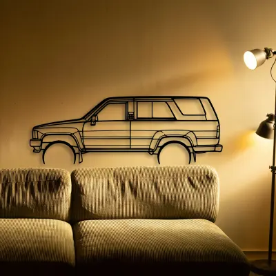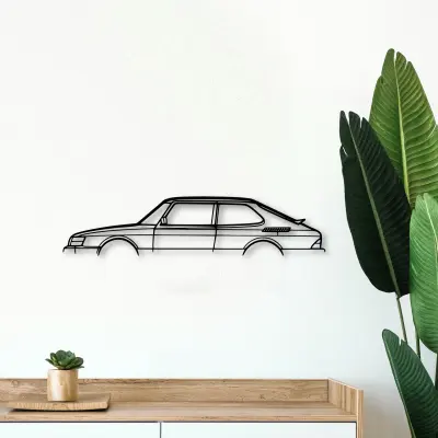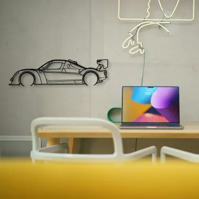
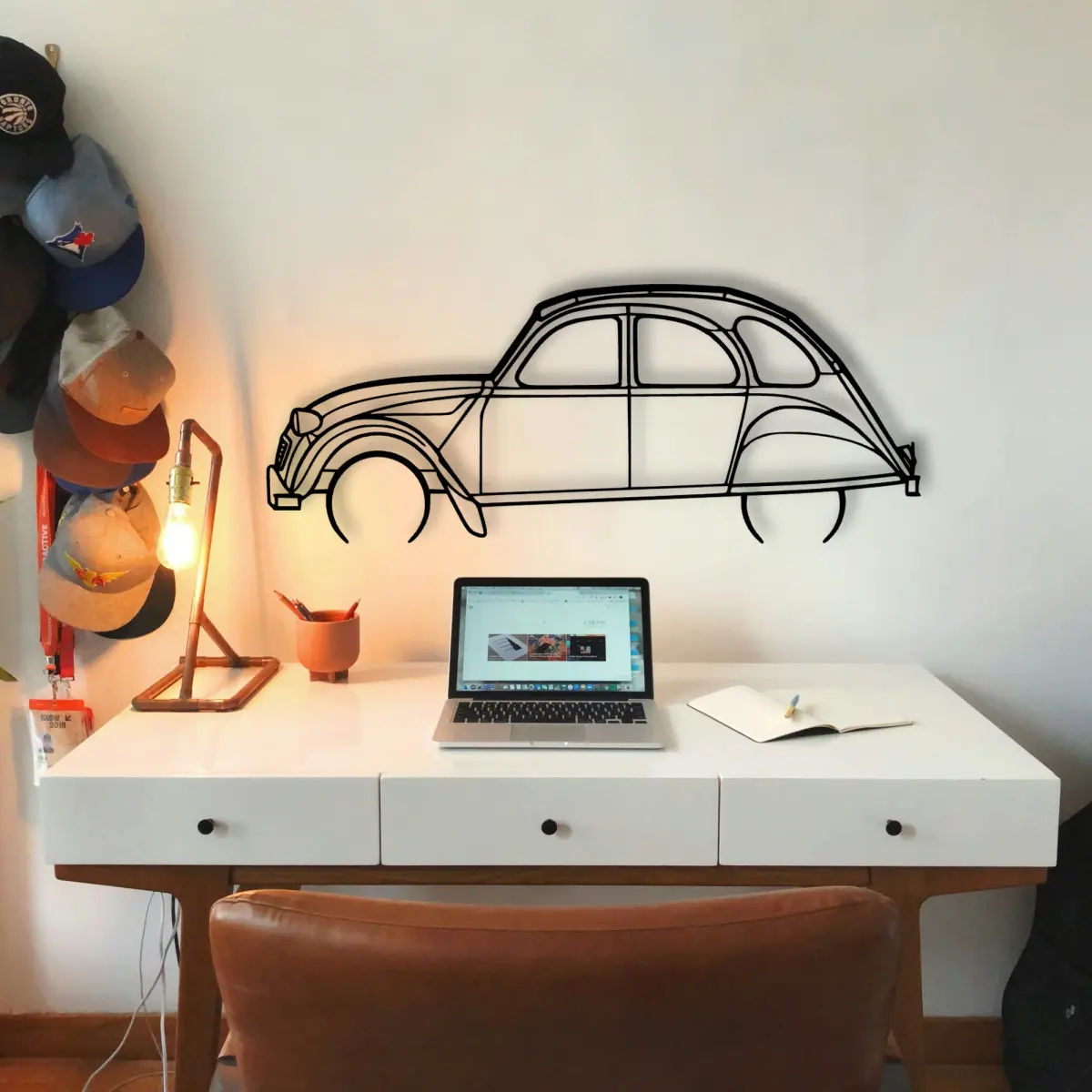
A laser-cut Citroën piece carries no colour of its own, which makes it a forgiving subject — and a demanding one, because every shadow counts.
The CitroëN 2cv 1966 dates to 1966, and that year's proportions are exactly what the cut outline keeps — the roofline and the stance are period-correct, not stylised.
At Tinvibe the Citroën is offered as a sheet-metal profile in size ladder, from 50 cm to 140 cm, finished for indoor wall display. The smaller sizes suit a shelf or a study; the larger sizes take a full living room.
Honest material, no colour
A Citroën profile in steel asks the line to do all the work — there is no livery, no badge colour, no gradient to lean on.
Keep the horizon steady
A row of Citroën silhouettes reads best with one shared baseline. Small height changes read as care, not accident.
More than one on the backing
If you collect, let the Citroën be one of a set with a rule. Next to its rivals, the differences are obvious.
Build the set
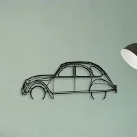
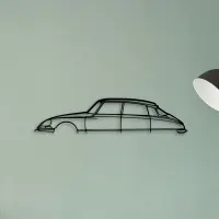
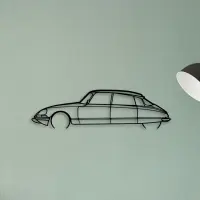
Group by a rule
A wall of Citroën outlines works when it has a rule — same era, same body style, or same marque. Without a rule it reads as a pile.
- Same era: let the decades argue with each other.
- Same body style: compare the proportions.
- Same marque: read the brand's habits at a glance.
Size ladder, one outline
Size ladder, one outline. The Citroën is offered from a 50 cm shelf piece up to a 140 cm statement, all cut to the same profile.
- 50 cm — a shelf or a study; an accent, not a feature.
- 80 cm — still modest, but reads across a doorway.
- 100 cm — the safe feature-wall default.
- 120 cm — for rooms where the car is the subject.
- 140 cm — the full statement piece.
Scale matters more than people expect. A piece that is too small disappears; one that is sized to the backing reads as intentional from the doorway.
A piece does not need a frame to feel finished. The cut edge is the frame.
A row of identical small frames fights itself. One larger outline settles the backing instead.
A profile ages better than a photograph. There is no moment to date it and no colour to fall out of fashion.
Small changes in height read as care. Keep the horizon line steady when you group more than one.
Metal keeps its line. Unlike paper, it will not curl, fade, or bow under a warm lamp.
Grouping works when the shapes contrast. A long low outline next to a tall upright one reads as a conversation, not a pile.
Cut metal has a weight that printed art lacks. The shadow it casts is part of the piece, not an accident of the light.
A profile travels. Move it between rooms and it still makes sense, because the shape is the message.
A dedicated wall beats a crowded one. Give the car room and it repays the attention.
Pick the outline that matches the room's energy: calm spaces want restraint, busy ones want a statement.
Depth comes from the shadow. The gap between metal and wall is part of the composition, not a flaw.