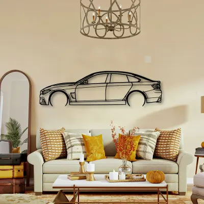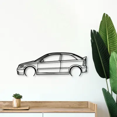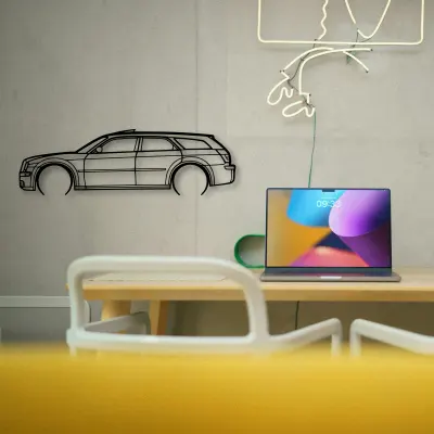
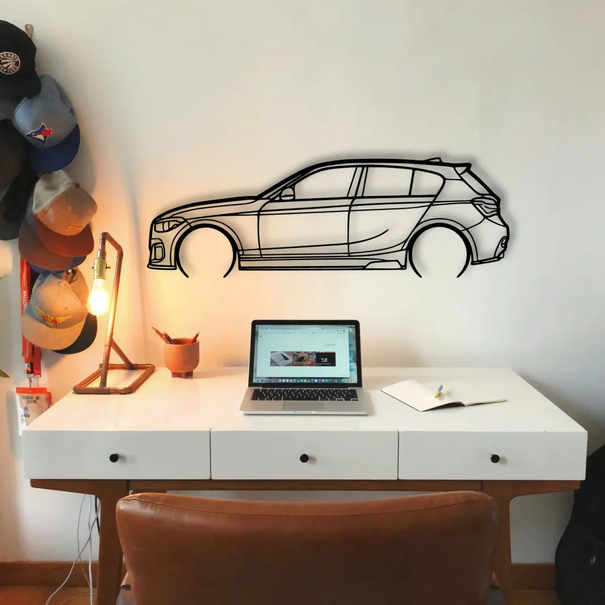
The BMW outline reads as a shape first and a car second. Photographing it is really about capturing that shape, not the metal.
What makes the BMW work as wall art is that it carries no colour of its own. Cut from sheet metal and finished for indoor display, it sits quietly in almost any room while the outline does the talking.
Honest material, no colour
A BMW silhouette in steel asks the line to do all the work — there is no livery, no badge colour, no gradient to lean on.
One light source beats two
For a BMW outline, one soft source from above and to the side is enough. Two competing lights flatten the very depth you want to show.
Why it suits a garage wall
Garages reward honest shapes. The BMW cut from steel belongs there in a way a framed poster never quite does.
Five sizes, one outline
Five sizes, one outline. The BMW is offered from a 50 cm shelf piece up to a 140 cm statement, all cut to the same profile.
- 50 cm — a shelf or a study; an accent, not a feature.
- 80 cm — still modest, but reads across a doorway.
- 100 cm — the safe feature-wall default.
- 120 cm — for rooms where the car is the subject.
- 140 cm — the full statement piece.
More than one on the wall
A row of BMW outlines, each a different car, turns a wall into a timeline you can read at a glance.
Build the set
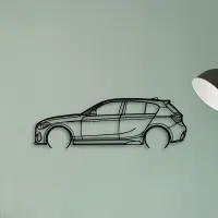
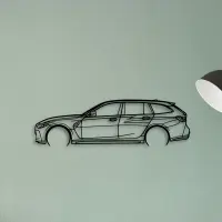
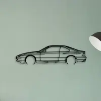
A neutral wall is a gift. It lets the cut do the talking without competing colour.
Recognition is the whole point. The outline is built so the car reads before the words do.
Placement is a quiet decision. Eye level for a feature wall, slightly above a desk, and well clear of a door swing that would clip it.
Start with one. A single correct piece teaches the eye what the rest of the wall should do.
The room sets the size. A busy wall wants a bigger outline to hold its own; a calm wall lets a smaller piece breathe.
Think in edges, not pictures. The cut defines the object, and the shape defines the cut.
Lighting decides the mood. An even wash from above flatters the edge; a single hard spotlight only hardens one corner.
Light from the side reveals the cut; light from the front flattens it. Aim for the reveal.
Pick the outline that matches the room's energy: calm spaces want restraint, busy ones want a statement.
A dedicated wall beats a crowded one. Give the car room and it repays the attention.
The shadow line is the second drawing. Where it falls tells you as much as the metal itself.
Quiet rooms suit a smaller silhouette; loud rooms need one that can hold its own from across the space.
Scale matters more than people expect. A piece that is too small disappears; one that is sized to the wall reads as intentional from the doorway.
Grouping works when the shapes contrast. A long low outline next to a tall upright one reads as a conversation, not a pile.
Cut metal has a weight that printed art lacks. The shadow it casts is part of the piece, not an accident of the light.